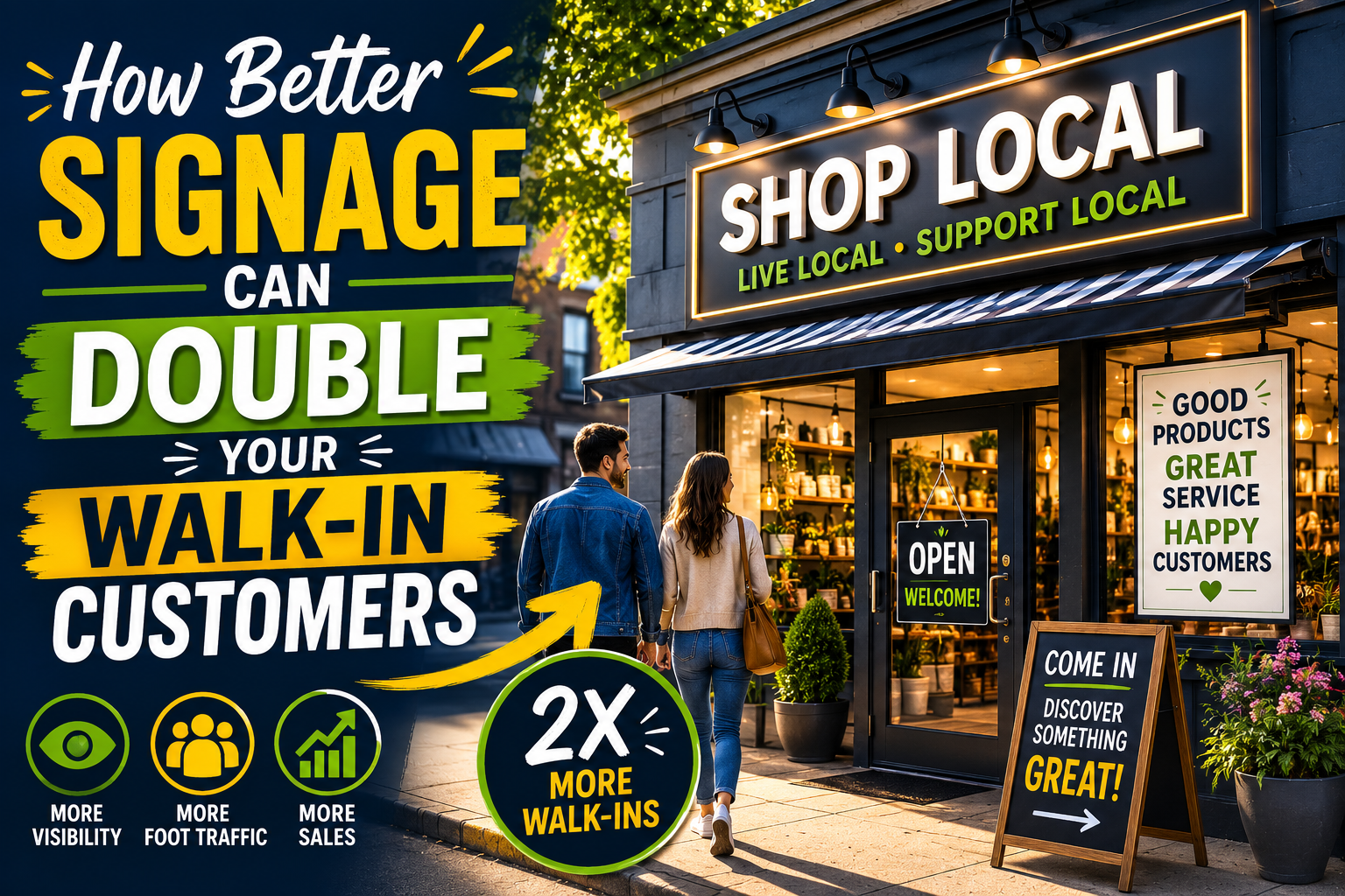
How Better Signage Can Double Your Walk-In Customers
Let me tell you something most business owners don’t want to hear:
- Your biggest sales problem probably isn’t your pricing…
- Or your offer…
- Or even your competition.
It’s the fact that people are walking right past your business without noticing you.
Cold. Hard. Truth.
You’re sitting there wondering why traffic is slow… while hundreds—maybe thousands—of potential buyers drift by every week, never giving you a second glance.
And the silent killer?
Bad signage.
Not just ugly signage. Not just outdated signage.
I’m talking about signage that fails to do the ONE job it exists for:
To stop people in their tracks and make them walk in.
Let’s fix that.
Your Sign Is a 24/7 Salesperson (And Right Now, It’s Probably Sleeping on the Job)
Imagine hiring a salesperson who:
- Doesn’t speak clearly
- Doesn’t grab attention
- Doesn’t explain what you do
- Doesn’t give people a reason to act
You’d fire them by lunch.
Yet that’s exactly what most business owners tolerate from their signage.
- Your sign isn’t decoration.
- It’s not there to “look nice.”
- It’s not there to impress your designer friends.
It’s there to pull strangers off the street and into your business.
If it’s not doing that… it’s dead weight.
The First Rule: Clarity Beats Cleverness (Every Time)
Here’s a mistake that kills foot traffic:
- Trying to be cute.
You’ve seen it before. Signs that make you squint and think:
“Wait… what do they even do?”
That moment of confusion?
That’s a lost customer.
Because nobody walking or driving by is in the mood to solve riddles.
They’re thinking:
- “I’m hungry.”
- “I need a haircut.”
- “I need this problem solved… now.”
If your sign doesn’t instantly answer:
“What is this place and why should I care?”
…you’re invisible.
The 3-Second Rule That Changes Everything
You’ve got about 3 seconds. Maybe less.
That’s how long someone gives your sign as they pass by.
So your message must hit fast and hit hard.
A high-performing sign answers three things immediately:
- What you offer
- Who it’s for
- Why it’s worth stopping for
For example:
Bad sign:
- Smith’s Corner”
Good sign:
- “Hot, Fresh BBQ – Ready in 5 Minutes”
See the difference?
One is a name.
The other is a reason to walk in.
Big, Bold, Impossible to Ignore
Let’s talk visibility.
Because even the best message is useless if nobody can read it.
Your sign should be readable from a distance. Period.
That means:
- Big letters (bigger than you think)
- High contrast colors (black on yellow, white on red, etc.)
- Simple fonts (no fancy script nonsense)
If someone driving by at 30 mph can’t read your sign…
You don’t have a sign.
You have a wall decoration.
Give Them a Reason to Act NOW
Here’s where things get interesting.
Most signage is passive.
- “Hey… we exist… come in if you feel like it…”
That’s weak.
You want active signage.
Signage that creates
urgency.
Add a reason to act now:
- “Today Only”
- “Limited Supply”
- “Walk-Ins Welcome – No Wait”
- “Free Sample Inside”
People respond to momentum.
They don’t want to miss out.
They don’t want to wait.
Your sign should tap into that.
The Power of Specificity
Vague signs get ignored.
Specific signs pull people in.
Instead of:
“Great Deals Inside”
Try:
- “50% Off All Shoes – Today Only”
Instead of:
“Best Coffee in Town”
Try:
- “$2 Fresh Brewed Coffee – All Day”
Specificity builds credibility.
It feels real. Concrete. Immediate.
And that’s what triggers action.
Use Directional and “Grabber” Signs
Here’s a trick most businesses completely overlook:
You don’t need just ONE sign.
You need a system.
Think:
- Sidewalk signs
- Window signs
- Parking lot signs
- Directional arrows
These act like breadcrumbs leading people straight to your door.
A simple sandwich board outside that says:
- “Hungry? → This Way”
…can outperform a fancy storefront sign ten times over.
Why?
Because it speaks directly to a need… in the moment.
Test Like a Mad Scientist
Here’s where you separate amateurs from pros.
Don’t “set and forget” your signage.
Test it.
- Change headlines
- Swap colors.
- Try different offers.
Track what happens:
Do more people walk in?
Do they mention the sign?
Do certain messages pull better than others?
Most business owners never test anything.
Which means they leave money on the table every single day.
You don’t need perfection.
You need improvement.
Match Your Sign to Your Market
Your signage should reflect the people you want to attract.
A high-end boutique?
- Clean, elegant, minimal.
A burger joint?
- Bold, loud, mouthwatering.
A kids’ store?
- Bright, playful, impossible to ignore.
If your sign feels out of sync with your audience…
They won’t feel like they belong.
And they’ll keep walking.
The “Double Your Traffic” Reality
Now let’s address the headline.
Can better signage really double your walk-in customers?
Absolutely.
Because most businesses are starting from a baseline of:
Almost no effective signage at all.
When you go from:
- Invisible → Visible
- Confusing → Clear
- Passive → Persuasive
…you don’t get small gains.
You get dramatic shifts.
- More eyeballs.
- More curiosity.
- More people stepping through your door.
The Simple Signage Upgrade Checklist
If you do nothing else, fix these:
Make your main message crystal clear
- Use big, bold, readable text
- Add a compelling reason to walk in
- Use specific offers, not vague claims
- Place signs where people actually look
- Add at least one “call-to-action” sign outside
Do that… and you’ll already be ahead of 90% of businesses out there.
Final Thought: Stop Being Invisible
Here’s the bottom line:
You don’t have a traffic problem.
You have an attention problem.
People are out there.
- They’re walking. Driving. Looking.
But they’re not noticing you.
Fix your signage… and you flip the switch.
- From ignored… to impossible to miss.
- From empty… to busy.
And once they’re inside?
That’s where your real selling begins.
But it all starts with the sign.
So take a hard look at yours.
Because right now… it’s either quietly making you money…
Or quietly
costing you a fortune.